Clustering wine data with K-means algorithm 🍷
Our dataset
Downloaded from Kaggle, is our unlabelled test dataset on different wines that we are going to perform unsupervised learning on, to explore the different clusters sharing similar behavior.
Key takeaways from exploration;
- Data included a
Customer_Segmentwhich we won’t need since we will be doing the segmentation ourselves - We do not have any missing data, convenient.
- We do not have any character vectors which is ideal for clustering, however scaling of the data is needed since the values on the different variables appear to be in significantly different scales.
Kmeans clustering
Thou shall not cluster without a number of centers !
For k-means clustering a parameter, k, is required which denotes the number of centers of clusters the data is to “have”, which kind of defeats our purpose of exploration. How do we give a parameter we ourselves do not have?
scree plotsto the rescue !!!
- their main purpose is to give us a good starting point on deciding how many clusters we are to assign.
- achieved by creating a grid of results based on different centers
- the optimum number of clusters would be found at the ‘elbow’ of the plot.

The screeplot(elbow plot) appears to have the elbow we are interested in around k = 3. We can start performing the clustering knowing the optimum centers
The following are some of our results from our kmeans clustering;
- summary of mean values of our clusters
| ingredients | cluster 1 | cluster 2 | cluster 3 |
|---|---|---|---|
| alcohol | 0.8328826 | -0.92346686 | 0.16444359 |
| malic_acid | -0.3029551 | -0.39293312 | 0.86909545 |
| ash | 0.3636801 | -0.49312571 | 0.18637259 |
| ash_alcanity | -0.6084749 | 0.17012195 | 0.52289244 |
| magnesium | 0.5759621 | -0.49032869 | -0.07526047 |
| total_phenols | 0.8827472 | -0.07576891 | -0.97657548 |
| flavanoids | 0.9750690 | 0.02075402 | -1.21182921 |
| nonflavanoid_phenols | -0.5605085 | -0.03343924 | 0.72402116 |
| proanthocyanins | 0.5786543 | 0.05810161 | -0.77751312 |
| color_intensity | 0.1705823 | -0.89937699 | 0.93889024 |
| hue | 0.4726504 | 0.46050459 | -1.16151216 |
| od280 | 0.7770551 | 0.27000254 | -1.28877614 |
| proline | 1.1220202 | -0.75172566 | -0.40594284 |
Key takeaways
From our summary of mean values we can see some of the difference in wine content standing out, For instance;
- cluster 1 appears to be the cluster with high
alcohol,total_phenols,ashandflavanoids, while showing low amount ofash_alcanity,nonflavanoid_phenols - cluster 2 has the lowest
alcoholvalue and the highesthuevalue, although it does not have many outstanding values. - cluster 1 & 2 appear to have similar
hueandcolor_intensityso they might be difficult to distinguish appearance-wise if they do not have any other observational distinguishing factors. - cluster 3 is almost the polar opposite to cluster 1 in some of the contents including
malic_acid,total_phenols,flavanoids,nonflavanoid_phenols, andash_alcanity
A wine connoisseur would probably already tell the wine types apart, and that is where domain knowledge comes in handy when it comes to any business problem.
- single row summary of our clustering
| totss | tot.withinss | betweenss | iter |
|---|---|---|---|
| 2301 | 1270.749 | 1030.251 | 2 |
let’s demistify some metrics
- total within sum of squares (tot.withinss)
- explains the variability within groups/clusters of interest
- total between sum of squares (betweenss)
- explains the variability between groups/clusters of interest
Visualization
Now we may want to see what our clusters look like in the data, but with so many variables(ingredients), a proper representation of most of the data in a 2D plot can only be possible by dimension reduction.
- Dimension reduction/Dimensionality reduction
- is the transformation of data from a high-dimensional space into a low-dimensional space so that the low-dimensional representation retains some meaningful properties of the original data, ideally close to its intrinsic dimension.
The alternative would be to pick the 2 variables that explain the most variation in the data for the x and y axis, which also requires a lot of trial and error.
So we will explore;
- linear dimension reduction with PCA
- non-linear dimension reduction with UMAP
1. Dimension reduction by PCA
A PCA (Principal Component Analysis) scree plot will show how much variability of the data is explained by each Principal Component after reducing our number of variables, in that effect, gives us a feel of how many PCs it would take to properly represent our data.
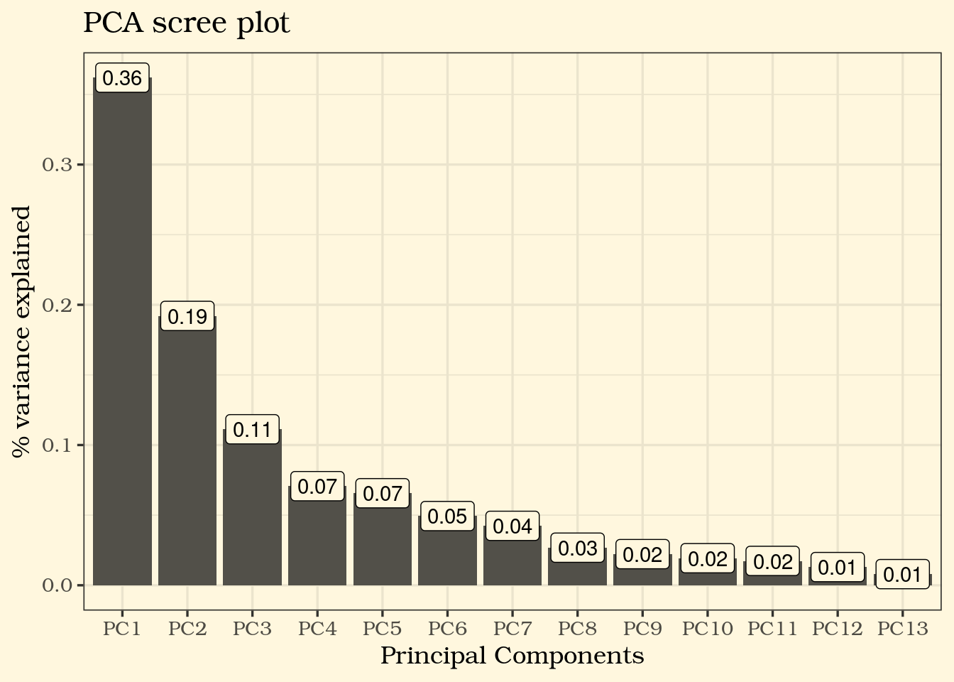
⚠️ From the PCA screeplot shows that PC1, PC2 and PC3 combined explains only about 66% of the variance in our data, so even a 3D plot with PCA values would not be the best representation of our data.
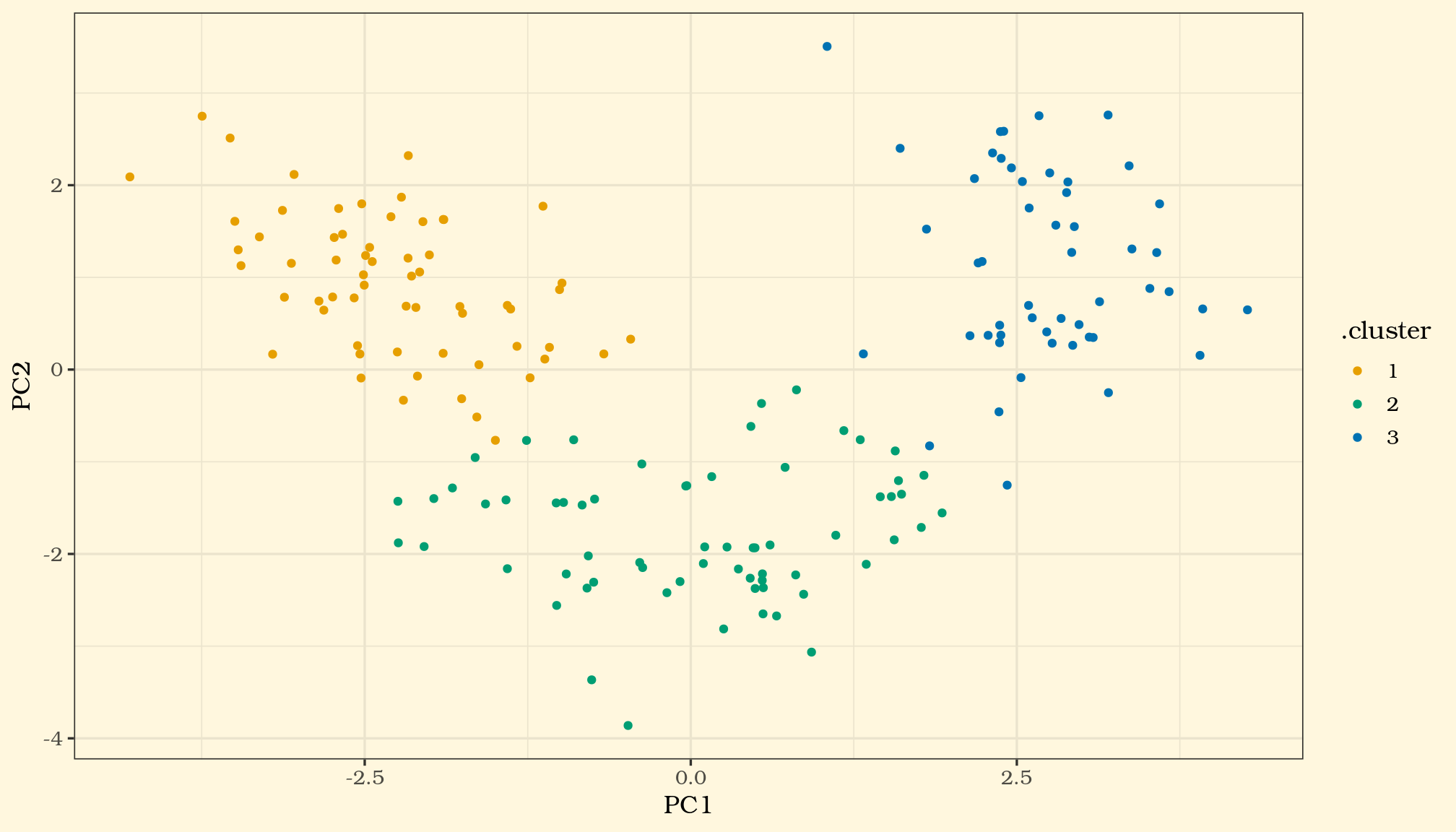
Out of curiosity, let us plot the clusters on the 2 PCs (PC1 and PC2) anyway and see how it looks in a 2 dimensional space, our x-y axis.
Now lets try a non-linear approach..
2. Dimension reduction by UMAP
Now let’s see how the non-linear approach results differ in the 2D space

Even without the red flag we got from the PCA’s performance on this specific dataset, I personally like the cluster representation in the latter approach.
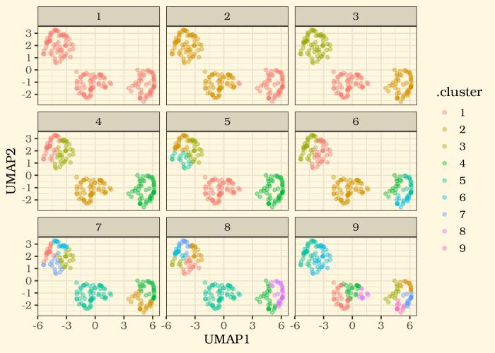
And now with a dimension reduction approach we are happy with, we can see how different k values may look in an x-y plane. let’s plot 9 trials.