The Facet Matrix 📊
This weekend while I was browsing through github for inspirational packages written in R to improve my data analysis workflow, I came across ggforce. This ggplot complimentary package written by the data imaginist, Thomas Lin Pedersen is now my newest addition to my data science toolbox, and here’s why.
The package itself has many different and useful functions but the specific function that caught my attention is the facet_matrix(), which allows a user to explore a dataset across different columns/variables in one go and in one condensed plot. What I liked most about the function is how easy it is to customize according to one’s needs.
The data
To see how the function works, lets use some Fuel economy data from 1999 to 2008 for 38 popular models of cars.
Description of the dataset
Format A data frame with 234 rows and 11 variables:
| column name | description |
|---|---|
| manufacturer | manufacturer name |
| displ | engine displacement, in litres |
| year | year of manufacture |
| cyl | number of cylinders |
| trans | type of transmission |
| drv | the type of drive train, where f = front-wheel drive, r = rear wheel drive, 4 = 4wd |
| cty | city miles per gallon |
| hwy | highway miles per gallon |
| fl | fuel type |
| class | “type” of car |
The plots
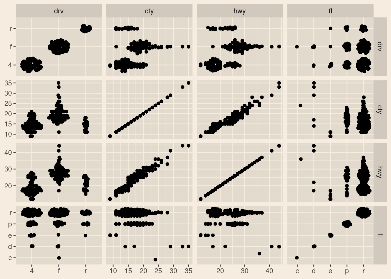
- with just coninuous various variables

- throw in some categorical variables
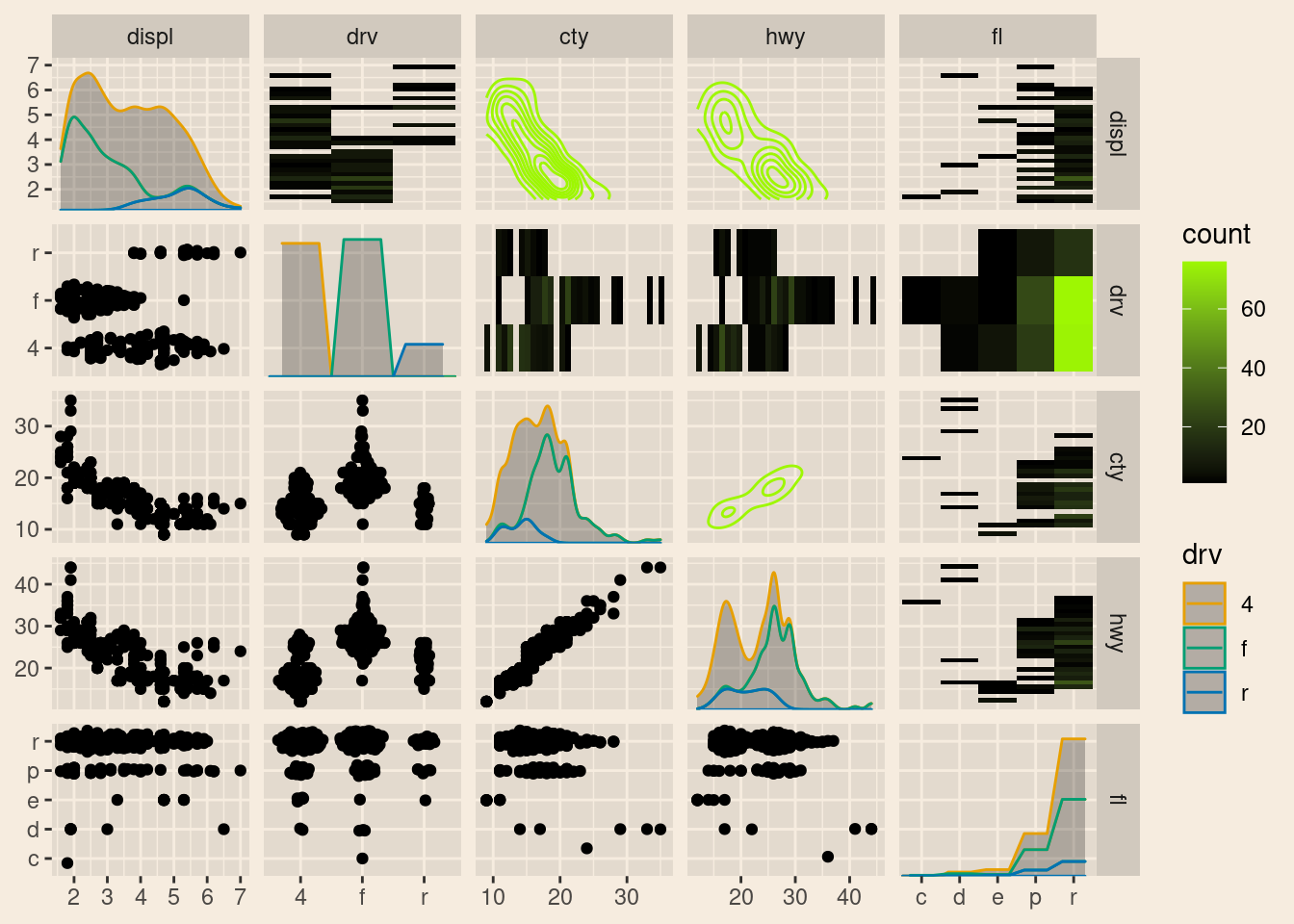
- specify diagonal to display the univariate distributions

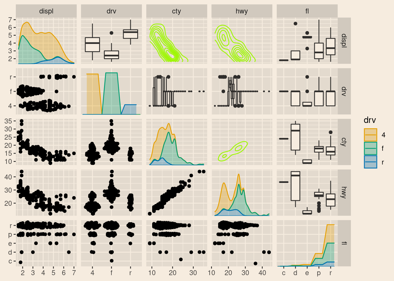
group the univariate distribution with a categorical variable to explore its influence
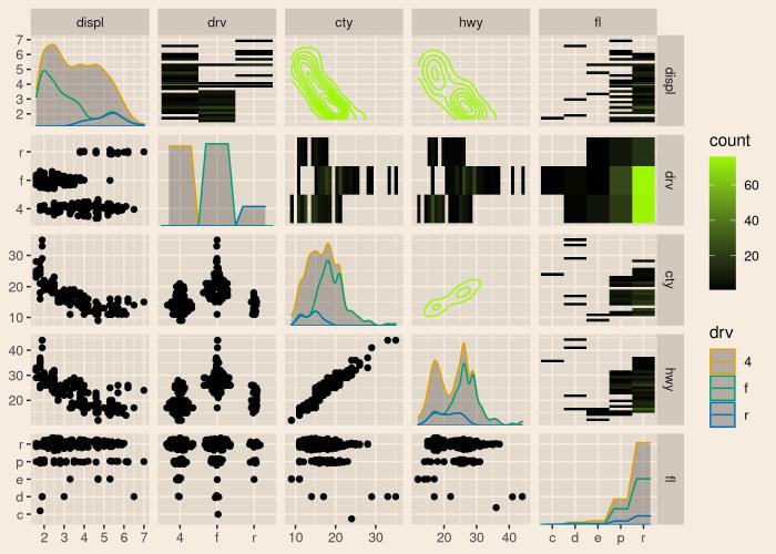
change the upper left diagonal to boxplots to reduce plot redundancy of repeated scatterplots that we don’t need and get a better feel of the outliers
- replace the boxplots with binned distributions